A look at the Affordable Connectivity Program’s inaugural year through interactive dashboards
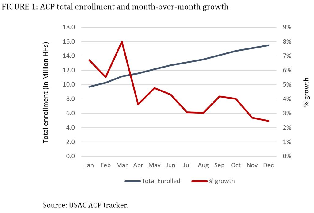
The Affordable Connectivity Program (ACP) is the most ambitious federal initiative put into place to bridge the broadband connectivity gap for low-income Americans. The ACP launched in January 2022, serving almost 10 million households that were transitioned from the Emergency Broadband Benefit program (EBB). By the end of 2022 it had enrolled another 5.4 million households for a total of about 15.4 million subscribers in December 2022. Using data from the ACS 2021 1-year estimates, our estimation is that about 55.3 million households are eligible for ACP[1]. This represents a nationwide uptake rate of approximately 28% and, as Figure 1 shows, the rate of growth in new enrollments has slowed down considerably.

A closer look at the data reveals significant geographical variation in the participation rate as well as in the rate of program growth since January 2022. To inform the policy conversation about ways to improve program performance, we present a set of interactive maps and dashboards that combine enrollment data from USAC with county-level demographic characteristics. They allow for comparisons within as well as across states, and provide tools that help identify areas of high growth and strong program performance for policy benchmarking.
The map below displays ACP participation rates by county. The color scheme distinguishes between counties where ACP participation is below the nationwide median (in red) and those where it is above the median (in green). TIP #1: use the buttons or sliders on the right to filter by rural/urban codes, by total number of households, or by ACP participation and growth levels. TIP #2: click on the Tableau icon at the bottom left to view the full size dashboard.
The dashboard below simultaneously displays ACP uptake rates in December 2022 and Jan-Dec enrollment growth for each state. For example the California dashboard (shown below) reveals that ACP uptake tends to be higher in California’s more populated counties in the southern part of the state and in the central valley, but these counties also exhibit weaker growth than the less populated and more rural counties in northern and eastern California, where in some cases enrollment has more than doubled during 2022. The dashboard on the left combines ACP uptake and growth in a 2×2 matrix with lines representing the median value. This four-quadrant format helps visualize counties with high uptake/high growth (right upper quadrant), high uptake/low growth (right bottom quadrant), low uptake/high growth (left upper quadrant) and low uptake/low growth (left bottom quadrant). TIP: use the filters to select other states, or limit the display to counties within a range of urban-rural characteristics, number of households, ACP participation, or ACP growth.
A third dashboard allows a comparison between selected states using the same four quadrant format based on median values for ACP uptake and growth rate. For example, a comparison between Louisiana and neighboring Mississippi reveals differences in uptake rates and growth trajectories. In Louisiana, high enrollment levels are associated with continued enrollment growth, while in Mississippi higher uptake is linked to weaker growth. TIP: use the filter on the right to select other states.
The full-size dashboards are accessible directly on Tableau Public:
– ACP Participation Map by Counties
– Individual State ACP Dashboard
– Scatterplot Comparison of Two (or a Few) States
The underlying data can be downloaded, as well as the tableau workbook and images of the dashboards in a variety of formats.
This work was made possible thanks to a grant from The Pew Charitable Trusts through its Broadband Access Initiative.
This work, including the dashboards, by Bar F. & Galperin H. is licensed under CC BY 4.0
[1] For an explanation of our eligibility estimation method and how it differs from others, see Galperin (2022), “Estimating participation in the Affordable Connectivity Program”.