Affordable Connectivity Program (ACP) State-Level Dashboard
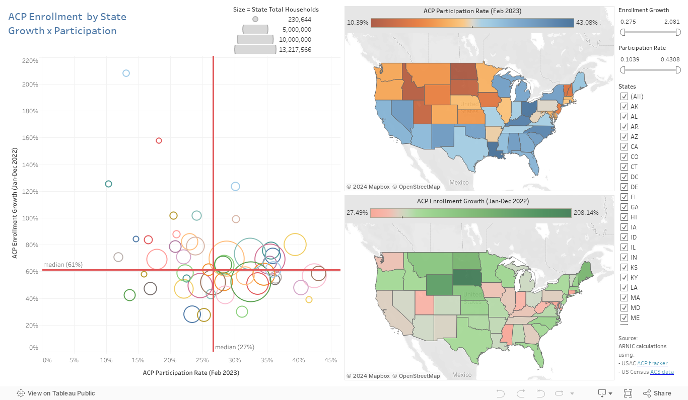
The ACP State-Level Dashboard simultaneously displays ACP participation rates in February 2023 and Jan-to-Dec 2022 enrollment growth for each state. The scatterplot on the left shows the relationship between state-level ACP participation and growth, with lines representing the median value for the selected states. This four-quadrant format helps visualize states with high participation/high growth (right upper quadrant), high participation/low growth (right bottom quadrant), low participation/high growth (left upper quadrant) and low participation/low growth (left bottom quadrant).
TIP: click on a state in either map or on the scatterplot to select it throughout the dashboard; use the sliders to select a range of participation and growth rate values. You can also drag your cursor to select a range of states — neighbors on the maps, or with close participation/growth values on the scatterplot.
This work was made possible thanks to a grant from The Pew Charitable Trusts through its Broadband Access Initiative.
[1] For an explanation of our eligibility estimation method and how it differs from others, see Galperin (2022), “Estimating participation in the Affordable Connectivity Program”.